
One of the most exciting things you’ll do in Excel is converting heaps of dreary data into stunning graphs and charts. Pie charts are among the most popular graphs to make because you can show data as a percentage of a total. However, it can be tricky to learn how to make a pie chart in Excel that looks just right.
Just a little bit of instruction goes a long way to make your charts shine. Here are a few tips to help you get off on the right foot.
Table of Contents
How to make a pie chart in Excel
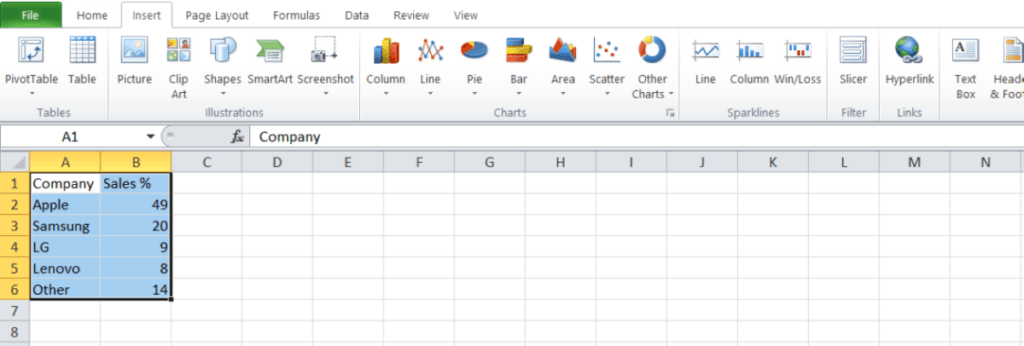
Before we dive in, remember that a pie chart isn’t the perfect graph for every data type. If you’re trying to show how a category grows across numerous time periods, there are probably better options. Once you’re sure that a pie chart is the one for you, start by highlighting your data.
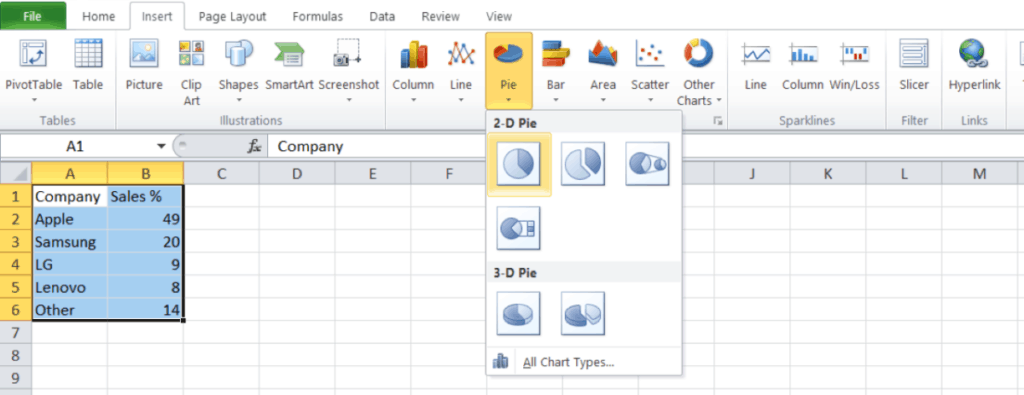
1. Once you have your data highlighted, navigate to the Charts tab and find the Pie Chart dropdown menu.
2. We’ve selected the 2-D Pie option for this example. You should see your graph appear on the spreadsheet with an automatic title and legend.
3. If you want to add labels to your pie chart, you first have to right-click on the chart to open the menu. From the menu, select the Add Data Labels option to display your data within the pie sections.
4. If you need to change your labels, you can right-click on the current labels and select the Format Data Labels tab. From here, you can easily add the category name and specify the data for each section of the pie.
These are the basic steps for creating your pie chart, but you might find that you need to add a little bit more information to make your chart clear.
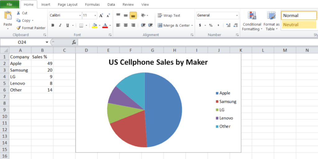
Suppose you want to add a title to your graph, select Charts in the menu ribbon, and head to chart layout. Now select Title Above Chart to display your title. You can also select other locations if you want your title below the chart.
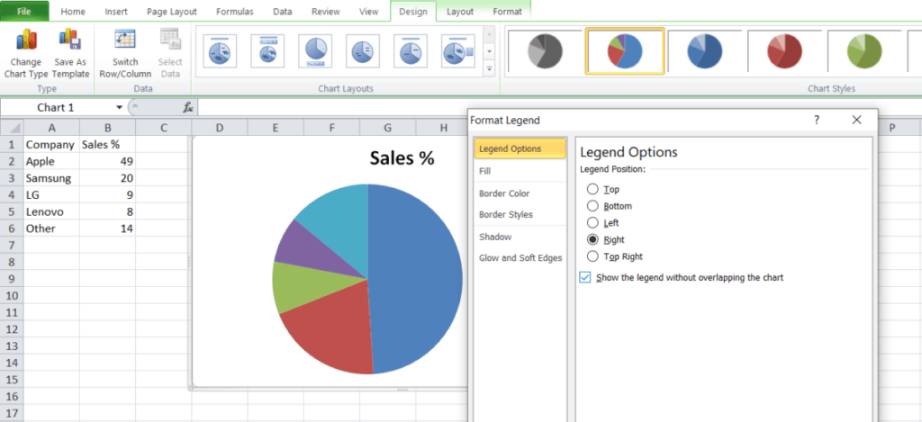
Pie charts include a legend by default, but you can easily change it with a little bit of work. Select the legend and right-click to open the menu. Now click on Format Legend to fine-tune your choices.
These are a few of the basic steps you might need to build the perfect pie chart, but it’s far from the limit of what you can do with Excel.
Related: How to insert multiple rows in Excel
What else can I learn?
If you’re ready to get even better with Excel, it doesn’t take too much training to get started. You can explore formulas, PivotTables, and even Macros, taking your skills from zero to hero. We’re highlighting a new deal on Tech Deals right now to give you a head start.
It’s called the Professional Microsoft Excel Certification Training Bundle, and you can grab all eight lessons and 45 hours of content right at a cut price now. It contains both beginner and advanced tutorials that you can tackle at your own pace.

The Professional Microsoft Excel Certification Training Bundle has a retail value of $1,600, but you can get started right now for just $39. It’s a great way to beef up your skills, and over 11,000 people have already started practicing.