
As you learn to use Excel, you’ll find that different graphs work well in different situations. Pie charts and bar graphs have their place, but sometimes a line graph is the best graph to get your point across.
Line graphs are great if you want to show growth trends or track data across multiple time periods. However, they don’t work as well with percentages or large data sets. Here’s how to make a line graph in Excel.
Table of Contents
How to make a line graph in Excel
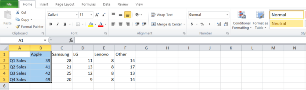
If you’re ready to get started, select your data first.
1. Line graphs feature two axes, so make sure that you’re highlighting at least two columns.
2. Head to the Insert tab and select head to the Charts group.
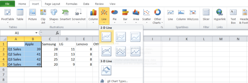
3. Now select the Insert Area or Line Chart icon and select the 2-D Line option.
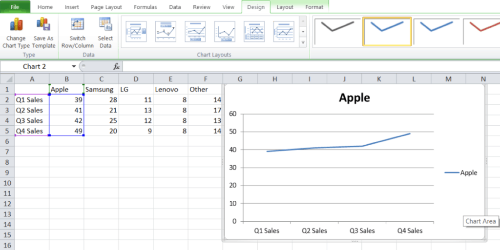
This is the easiest way to build a basic line graph in Excel, and if you highlight more than one column, it should help you graph multiple lines at one time. If you want to add titles or labels, you can do so in just minutes.
If you want to add a title to your graph, select Charts in the menu ribbon and head to Chart Layout. Now select Title Above Chart to display your title. You can also select other locations if you want your title below the chart.
Pie charts include a legend by default, but you can easily change it with a little bit of work. Select the legend and right-click to open the menu. Now click on Format Legend to fine-tune your choices.
And there you have it: One fully detailed line chart in Excel. But why stop there?
Related: How to unhide columns in Microsoft Excel
How can I learn more?
If you’re hooked on the graphs you’ve already created, you’ll be surprised where just a little more training can take you. You can pick up a few best-seller courses that combine Excel with basic business skills and give your resume a boost. We’re spotlighting a learning kit that packs a few of the most useful skills at a killer price.
If you’re ready to start studying, it’s called the Microsoft Excel Bootcamp Bundle and it includes five modules and nearly 80 total hours of content. You can dig into beginner and advanced skills or move onto PivotTables and VBA skills. The best part is that you can do all of this and save over 95% right now.
The Microsoft Excel Bootcamp Bundle has a total retail value of $1,725 but you can get started now for just $29.99 on Tech Deals. Over 9,000 people have already signed up to boost their spreadsheet skills, so the learning kit must be doing something right.
You can learn more and sign up now via the widget below.