
Once you’ve wrapped your head around how to manage your data in Excel, you’ll probably want to use it to enhance your presentations. Graphs are a powerful way to flex your creativity while showing off your vital information. Here are a few tips on how to make a graph in Excel.
The process of creating charts and graphs in Excel isn’t too tricky, but when you open the customization menus, it’s easy to feel lost. We’ll start below by assuming that you already have all of your data on your sheet.
Table of Contents
How to make a graph in Excel
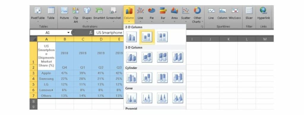
1. Choose the correct type of graph for your data. Excel offers nine different options, including bar graphs, line graphs, pie graphs, and more. However, not every graph is suitable for every type of data.
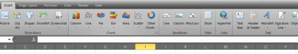
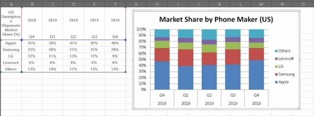
2. Highlight your data and insert your graph. This is the most crucial step, as it determines just what will go into your graph. Like many other Excel functions, highlight your information and make your selection in the Chart section of the Insert tab.
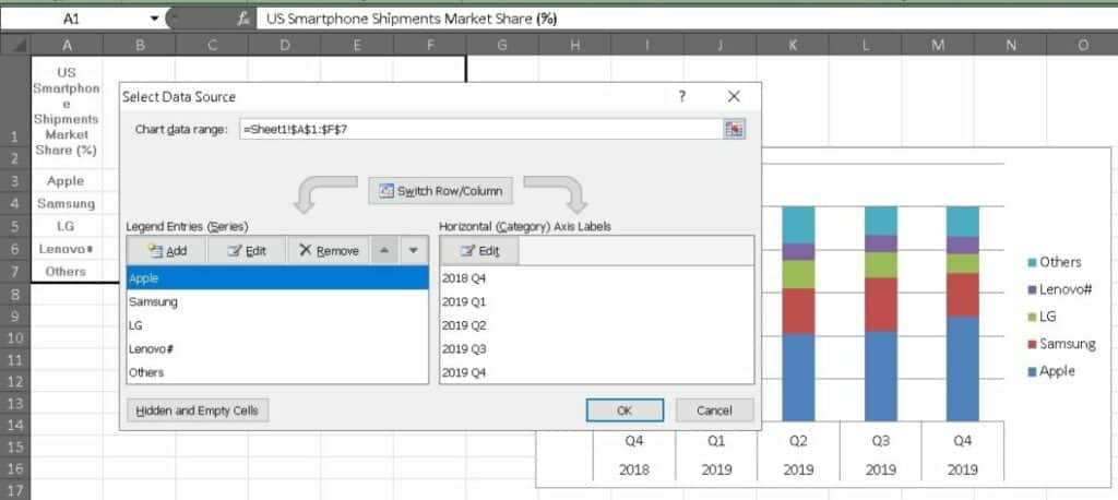
3. Make sure your data is on the correct axis. Sometimes you’ll find that your data populates on the wrong axis. After all, Excel can’t quite read your mind. To swap the axis, right-click on your graph and choose Select Data. Now click on Switch Row/Column.
4. Now, it’s time to play with the design and colors. Click on the Chart Design tab, and now you can choose from some preset graph designs. You can also format the legend of your graph by clicking on it.
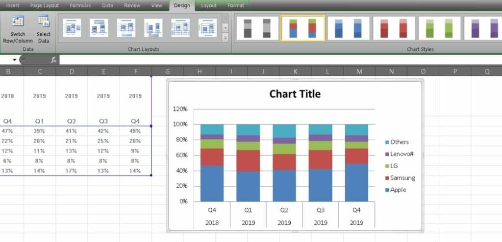
5. You can also adjust the size of your legend to make it easier to read. To do this, click on each label or legend and head to the Home tab to adjust the size.
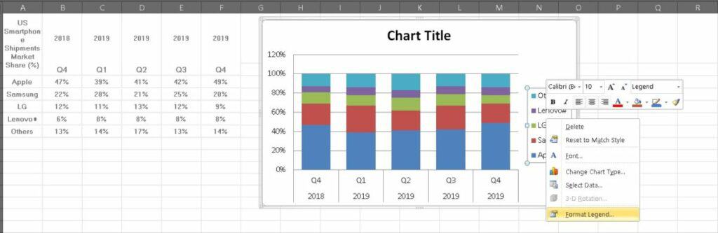
6. Adjust the Y-axis measurement options if needed. You can click on the Y-axis and select Format Axis to change the format to percentages and even manage the number of decimal places.
7. Finally, give your graph a name. Naming your graph is one of the easiest ways to help your audience understand exactly what your graph shows. You want to make sure that it’s specific without being too long and cumbersome.
Now you have a detailed, well-named, and informative graph. You’re one step closer to becoming an Excel expert.
Related: How to create a Macro in Excel
What else should I know?
Once you master charts and graphs, you’ll be able to handle a good chunk of what many people do in Excel every day. However, just a bit more training can help you solidify your skills as a genuine Excel pro. Luckily for you, we’re highlighting a beginner-friendly learning kit that can do just that.
The Professional Microsoft Excel Certification Training Bundle packs 45 hours of content to help you get started. You can dig into everything from the basics of formulas and spreadsheet management up to Macros and PivotTables.
The eight modules in the learning kit have a total combined retail value of $1,600, but you can get started for just a fraction of the price. Tech Deals is offering access for just $39 right now.
Over 9,000 people have already signed up to sharpen their Excel skills. If you want to join them, check it out by hitting the widget below.