Google Docs is a powerful word processor and has lots of useful features to improve productivity. For example, you can create graphs to display your data in an easy-to-read way.
You can choose from multiple types of charts, but you’ll have to use Google Sheets instead of Google Docs to do it. It’s not possible to create a graph in Google Docs, but you can link to it from Google Sheets.
Here’s how to create a graph or chart in Google Sheets.
- Open a spreadsheet in Google Sheets.
- Select all the cells that you want to include in your graph.
- In the top toolbar, click “Insert” > “Chart”.
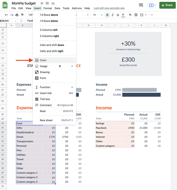
Your chart will be added to your sheet. On the right side of the document, you’ll see a chart editor. Here you can set up and customize your chart.
Here’s how to do it.
1. Choose the Chart Type from the drop-down menu. Options include Line, Area, Column, Pie, Scatter, Map, and more.
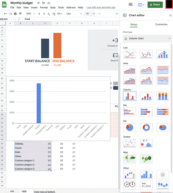
2. Select stacking.
3. Modify the data range if necessary, to include or exclude cells.
Related: How to Save a Google Doc
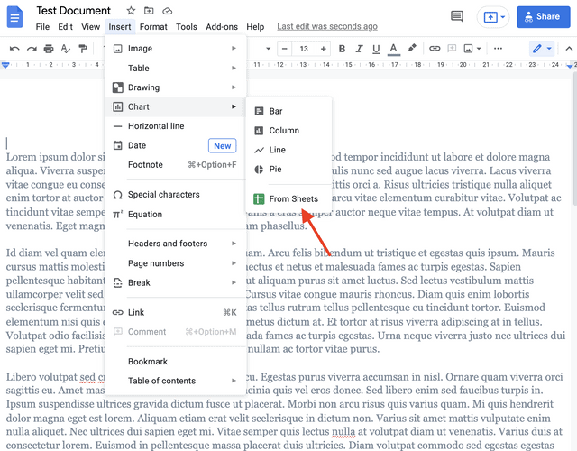
To link your graph from Google Sheets to a Google Doc, follow the next steps.
1. Open the document you want to add a graph to.
2. In the toolbar, go to “Insert” > “Chart” > “From Sheets”.
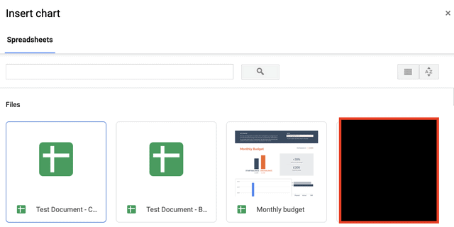
3. Choose the Google Sheets that contains the chart you want to use from the pop-up box that appears and click “Select”.
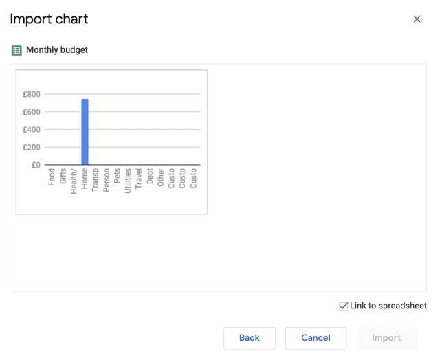
4. Click on the chart you want to add to select it and then click “Import”. If you want to link the graph to the spreadsheet, make sure you check the box next to “Link to Spreadsheet”.
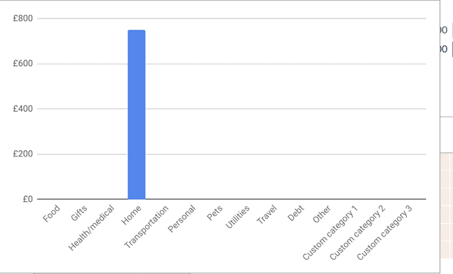
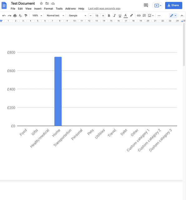
5. Your graph will now be inserted in the Google Doc.
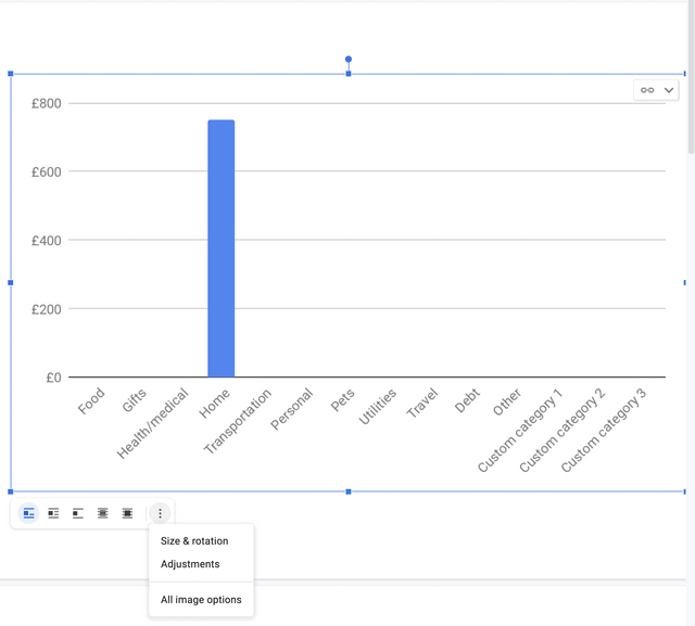
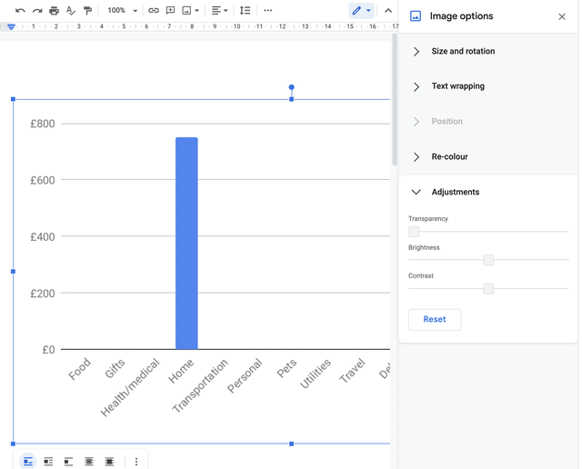
6. If you want to make any adjustments click on the graph to see a small toolbar that allows you to change the size of the graph, rotate it and make other adjustments such as contrast, brightness and clarity.